Teklif All

Responsive UI & UX Design

One of the most critical points in users’ digital experiences is that they feel the same quality regardless of the device they use. Responsive UI & UX design ensures that web and mobile interfaces adapt to any screen size, providing the user with a seamless experience. At Ajans360, we develop responsive designs that are not only aesthetically pleasing, but also functional, fast, and user-focused. This allows your brand to reflect its digital identity strongly while providing a seamless experience across desktop, tablet, and mobile devices.

Responsive-UI-&-UX-Tasarım
bpn-logo-2025tas-otel-logoVoltaŞarkışla BelediyesiStorcellBolu Bağışçılar vakfıboluspor-logo-3

Responsive UI/UX Design Process

Responsive design is not just about “fitting” the screen; it’s about establishing the same quality and user flow on every device. At Ajans360, we plan mobile-first, enhancing the experience on tablets and desktops; we keep hierarchy, readability, and CTAs clear on every screen. We incorporate performance and visual layout, and when needed, we plan and implement improvements based on data with the client.

Shall we have a acoffee and get started? Let's Meet Now Sağ ok
check

We conduct target & user analysis; we clarify the brand’s purpose, industry behaviors, and which devices the traffic comes from, then create a responsive roadmap.

ui-design

We create a wireframe + breakdown plan; we determine the flows for mobile–tablet–desktop, designing a structure that progresses with the same logic on every screen.

smartphone

We create a visual system & UI language; we organize colors, typography, icons, and visuals into a clean, brand-specific layout that is readable at any resolution

inspiration

We design responsive interactions; we optimize menu, button, grid, and spacing decisions for devices so they are “understandable at a glance”.

video-editor

We conduct cross-device/testing processes; we check different screen sizes, browsers, and operating systems and eliminate the risk of misalignment/distortion before publication

overpopulation

Post-publication evaluation is conducted; feedback is analyzed, and we proceed by planning with the client and proposing improvement/update initiatives.

Types of Responsive UI & UX Design

Responsive design varies according to different needs and usage scenarios. Since each brand’s target audience, industry, and user behavior are different, the responsive approach used also changes. At Ajans360, we select the most suitable design type that will maximize both performance and user experience, and shape the project accordingly.

Shall we have a acoffee and get started? Let's Meet Now Sağ ok
mobli

Mobile-First Design

Since the majority of users come from mobile, we first establish the fastest and clearest flow on mobile screens. Then we scale to tablets and desktops to provide a consistent experience on every device.

olcme

Desktop-First Design

In scenarios with heavy desktop usage, such as B2B, we first design the wide screen experience. Then, we optimize critical content and actions with the mobile adaptation without losing anything.

STRATEJİ

Fluid Grid-Based Designs

As the screen size changes, content automatically realigns using the smart grid system. This ensures that the layout remains balanced, readability stays high, and the visual structure stays clean at every size.

analyzweb

Adaptive Designs

We offer a specially optimized look on every platform with different interface variations based on device types. This allows for more controlled management of the experience, especially for brands with different user profiles.

Teklif Al
Teklif Al
Teklif Al
Teklif Al
Teklif Al
Teklif Al
Teklif Al
Teklif Al
Teklif Al
Teklif Al
Teklif Al
Teklif Al
Teklif Al
Teklif Al
Teklif Al
Teklif Al
Teklif Al
Teklif Al
Corporate Solutions
forSuccessful Brands

Responsive UI & UX Design Analysis and Performance Tracking

Responsive UI & UX design truly succeeds when it delivers the same experience across different devices. At Ajans360, we don’t just create designs; we also regularly analyze their performance to continuously improve the user experience.

Shall we have a acoffee and get started? Let's Meet Now Sağ ok
Cihaz-Uyum-Testleri

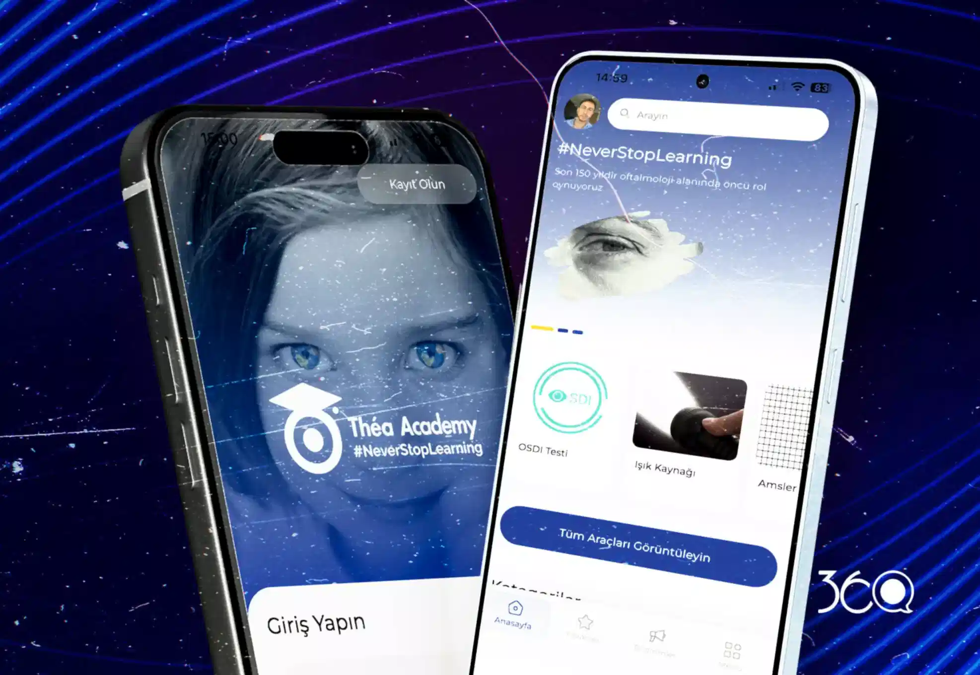
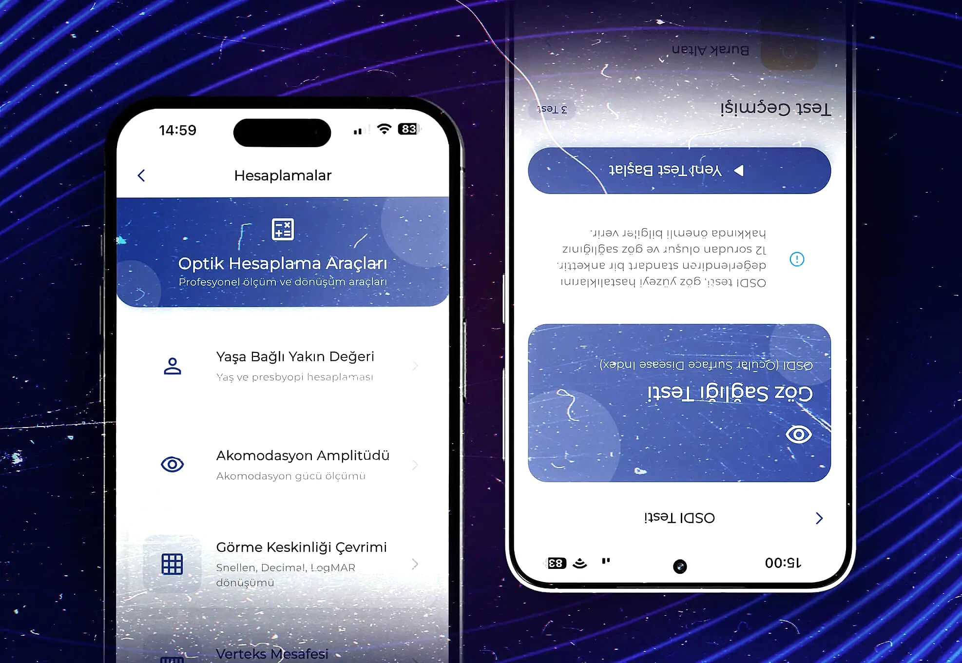
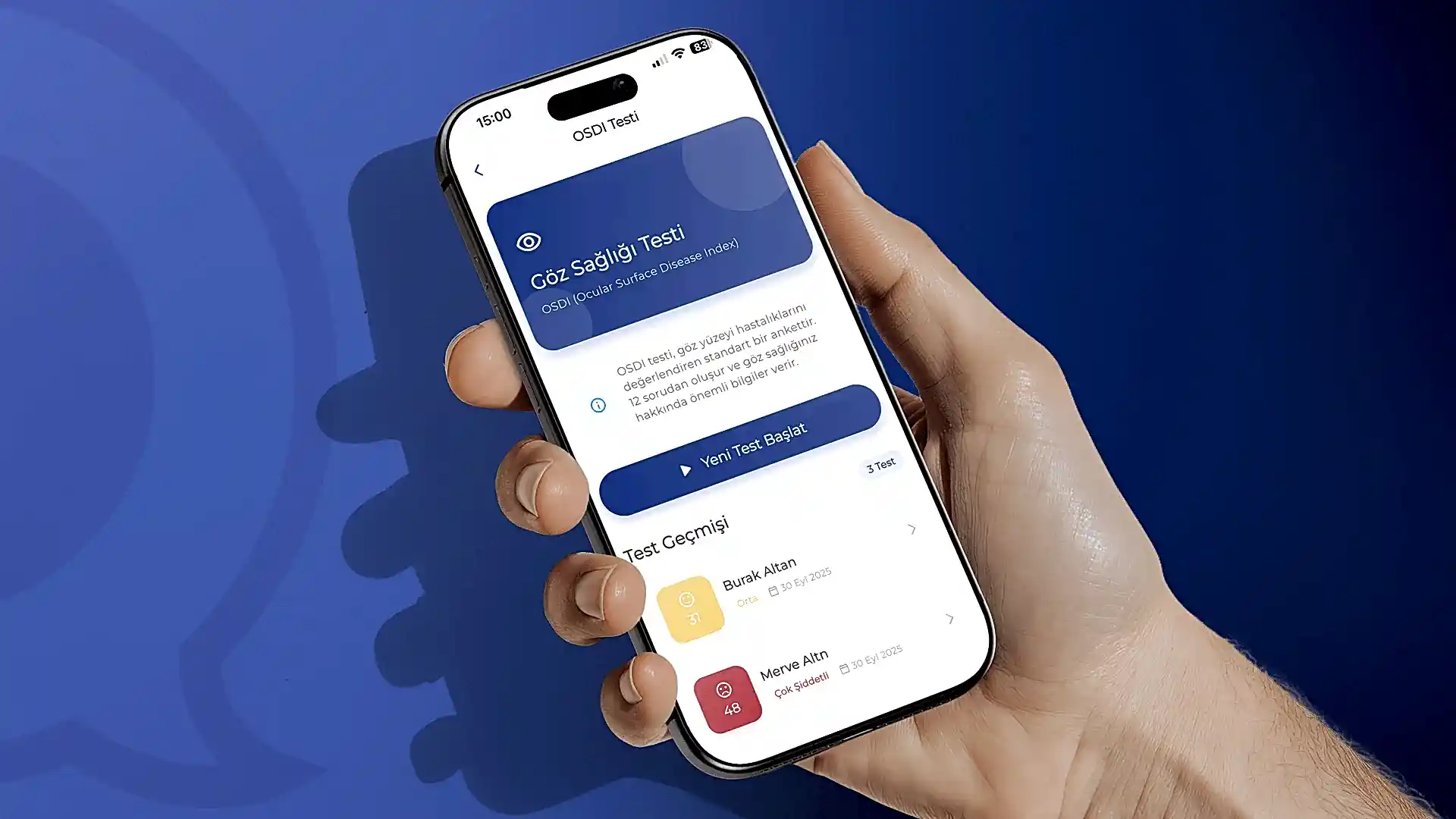
Device Compatibility Tests

The most important indicator of a responsive design is its ability to maintain the same layout across different devices. Therefore, we test our designs across a wide range, from desktop computers to mobile phones, and from tablets to screens with various resolutions. Taking browser differences into account, we conduct trials on platforms such as Chrome, Safari, Firefox, and Edge. Thanks to these tests, we ensure that users enjoy a seamless experience without any distortion, shifting, or visual clutter on any device.

User Behavior Analysis

Understanding how users navigate the site or application is a critical step in measuring the quality of responsive design. Which devices they use to log in, which pages they spend more time on, and at which points they leave the site provide us with valuable insights. For example, if we notice that mobile visitors are leaving the site during the payment step, we simplify that screen and make it more understandable. This way, we make the user journey easier and enhance the experience across all devices.


Kullanıcı-Davranış-Analizi (1)
Performans-ve-Yüklenme-Hızı-Ölçümleri

Performance and Load Speed Measurements

One of the most common problems encountered with responsive designs is variations in loading speed across different devices. Image size, code complexity, and the components used directly affect page speed. At Ajans360, we optimize all images, remove unnecessary code, and maximize page loading speed on both mobile and desktop devices. Providing users with a fast experience is the most important key to keeping them on the site and driving conversions.


Interaction Measurements

Whether a design is responsive or not is understood not only visually but also through user interaction. Easy menu navigation, buttons that can be clicked comfortably on any device, and forms that can be filled out without any problems are central to the user experience. We ensure that users experience no difficulties on any device by testing every detail, from button sizes to menu flow. If users struggle to fill out forms on mobile, we rearrange those steps and make the experience intuitive.


Etkileşim-Ölçümleri (3)
Sürekli-Optimizasyon-ve-Güncellemeler-

Continuous Optimization and Updates

The digital world is constantly evolving; every year brings new devices, different screen sizes, and changing user habits. Therefore, responsive design is not a “set it and forget it” task. At Ajans360, we regularly update your designs, make them compatible with new devices, and keep up with trends to ensure the user experience is always up to date. This way, your designs continue to perform just as well in the future as they do today.


Data-Driven Reporting

We provide brands with regular reports detailing the results of all these analyses and improvements. These reports clearly show which devices deliver a better user experience, which screens encounter issues, and how much benefit the updates provide. This allows brands to see the real impact of their responsive design investments and plan future strategies based on concrete data.

Veriye-Dayalı-Raporlama (1)

The Path to Success in Responsive UI & UX Design

Needs Analysis, Targeting, and Strategic Planning

Needs Analysis, Targeting, and Strategic Planning

Needs Analysis, Targeting, and Strategic Planning

roadmap.

Wireframe, Information Architecture, and Content Flow Design

Wireframe, Information Architecture, and Content Flow Design

Wireframe, Information Architecture, and Content Flow Design

We establish a clear hierarchy for quick access to content on mobile, tablet, and desktop; we plan menus, page flow, and critical CTAs in a consistent structure.

Multi-Device Testing, Fine-Tuning, and Conversion Optimization

Multi-Device Testing, Fine-Tuning, and Conversion Optimization

Multi-Device Testing, Fine-Tuning, and Conversion Optimization

We eliminate glitches by testing on different devices and browsers, enhance readability and interactivity, and make the experience flawless and measurable.

Our Responsive UI/UX Design Success Stories

135 Increase in Doctor Engagement and Active Usage
110 Medical Content and Video Access Speed
95 Case Analysis and Digital Test Accuracy
80 Operational Content Management Efficiency

Doctor Case Analysis Training Mobile Application

With the Théa Academy project, we built a comprehensive mobile application ecosystem that supports the professional development and academic sharing of specialist ophthalmologists for a leading pharmaceutical company in the field of eye health. We began the process with a detailed briefing phase, analyzing the needs of healthcare professionals. We then brought the entire user journey to life through Figma, designing a simple and functional user interface (UI/UX) tailored to doctors’ needs.

On the technical infrastructure side, we built a modular structure that allows doctors to communicate securely with each other, examine complex cases and analyses, and provide instant access to medical training videos. We offer digital tools that support the diagnostic process with professional eye tests integrated into the application, while our custom management panel allows the company to manage its entire content process completely independently. With this project, published on the Apple App Store and Google Play Store platforms, we have created a future-ready health technology platform that strengthens the brand’s scientific authority in the digital world.

Mobile Application Health Technologies (HealthTech) Case Analysis Software
165 Increase in Tourist Engagement and Active Usage
140 Route Completion and Discovery Rate
120 Business Views and Direction Clicks
90 Operational Efficiency in Content Management

Discover Nallıhan with Destination Management

In the Ankara Development Agency-supported “Exploring Nallıhan” project, our goal was clear: To create a digital guide that even a tourist visiting Nallıhan for the first time could use to choose their route and set off without asking anyone. That’s why we worked on the ground with the region’s restaurants, hotels, points of interest, and especially walking routes one by one; we scanned the trails with GPS devices and entered the distance, direction, and destination data into the application.

Visitors who download the app can view the routes on a map, easily reach the starting and ending points of their desired trail, discover nearby points of interest in real time, and explore Nallıhan in a planned, safe, and smooth manner. On the back end, we have designed a comprehensive management panel: content, locations, businesses, and routes are updated from a single center; ensuring the app stays up-to-date without relying on field operations and remains constantly current.

Public Project Tourism Application Route & GPS Mapping